Some of my favourite recent design projects…
I’d love to see your project here one day, if you would too then get it touch.

Brand strategy, UI design and illustration for insurance disruptor
This client came to me having identified an opportunity but without a strategy in place to act on it. All they knew was that they wanted to sell through social media adverts.
New rules designed to protect consumers from being pressured into buying expensive gap insurance policies on the spot by car salesmen meant that there was now the potential to offer consumers a completely different experience.

The opportunity
This client came to me having identified an opportunity but without a strategy in place to act on it. All they knew was that they wanted to sell through social media adverts.
New rules designed to protect consumers from being pressured into buying expensive gap insurance policies on the spot by car salesmen meant that there was now the potential to offer consumers a completely different experience.
Now that consumers are free to purchase gap insurance online at their own pace, should the new brand take a new approach to selling warranty insurance?
The Research
My competitor audit revealed that the industry currently heavily over uses two things: masculine imagery and fear, ‘i.e pictures of male mechanics, flashy looking black sports cars and broken down cars. The colours red and blue were overused and logo’s all had a similar style.
In contrast, looking at ad campaigns on social media for other products it was clear that the most successful were usually those that carried a positive message and often had a lighter friendlier feel.
The hypothesis
The audience: Men who drive sports cars are not the only people who buy cars.
The buying motivation: Fear isn’t the only motivation to buy gap insurance any more. Under the old rules the main contact point between the brand and the consumer is when they are in the process of parting with a lot of money and the consumer is warned by car salesmen that they are at risk of losing that money unless they buy gap insurance right now. Cue a leaflet with a picture of a crashed sports car on it.
The new rules mean that consumers will be buying the insurance under different circumstances - online at their own pace. Rather than feeling pressured they are feeling in control of their buying decision. So relying on fear is no longer necessary.
On a simple level - a brand that focusses on the positive motivations behind buying car gap insurance will stand out in the sea of blue and red.
The new brand…
I created the name, the strap-line and the logo, along with the illustrations and the marketing website and the user interface for the online quoting and purchasing application. This enabled the client to get the new product to market to test reactions to it without investing huge amounts with an expensive agency.

The brand story
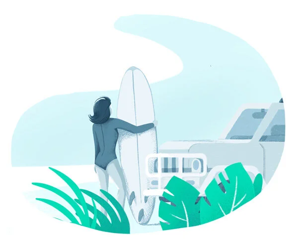
Our buyer is feeling good. She’s just been handed the keys to her new car, she’s been saving up for it for a while. This new car is part of her identity, it’s part of her future plans. She’s planning on driving to the south of France in the summer to go surfing and she can’t wait. Her car is a means to a lifestyle she wants, it’s not about the car, it’s about the experiences she’ll be able to have now she has it.
She’s online looking for Gap insurance, the car salesman tried to sell it to her, which she didn’t enjoy, but she knew she didn’t have to buy it on the spot. All of the providers look kind of negative and she’s not sure she trusts them. Until she comes across Sitback.
Everything about Sitback makes her feel calm and positive - a breath of fresh air. She is able to quickly and easily use their website to buy her Gap insurance - with just two products to choose from she’s not overwhelmed with choice.
When she finishes the confirmation reads“You’re covered, so Sitback and enjoy your new car!”
The website
The website was designed to be built with a custom CMS - because the client wanted the flexibility to try out different messaging. I created a library of styles and components that could be used by their in house team to experiment with content.


Brand design, strategy and web design a for sustainable marketing company
Founder of The Sustainable Results Lab, Ruth Palmer, came to me to help her achieve her dream of creating a business that brings world-class digital marketing to the environmental sector…

The brief…
Founder of The Sustainable Results Lab, Ruth Smith, came to me to help her achieve her dream of creating a business that brings world-class digital marketing to the environmental sector.
Ruth explained to me that she’d discovered an abundance of sustainable tech companies creating the most incredible technologies - the kind of tech that has the power to change our world for the better. But that many of these businesses were run by engineers who were full of passion but lacking in the ability to explain what their technology can do for the world, in terms simple enough that it engages the right people - their potential clients and investors.
Ruth needed a brand and website that could demonstrate how engaging marketing can boost a business.
The process…
Step1 - Brand discovery:
During a 2.5 hour workshop I guided Ruth through a series of exercises designed to help her explore her customer’s motivations, analyse her competitors and identify the essence of her business. This workshop helped us uncover the strengths in Ruth’s business that we should be expressing with the brand.
Step 2 - Creating the brand:
After the workshop I created the following Why, What, How statement:
Why: We want to leave this planet in better shape than we found it.
What: We help environmental businesses grow. Sustainably.
How: With our process: Research. Create. Measure. Grow. Repeat.
These statements were at the front of my mind when I created the brand mark.


< The What statement became the business strap-line. It helped Ruth express succinctly exactly what her business does.
The illustration style:
A lot of Sustainable Results Lab’s clients struggle to create visuals that explained their complex technologies in a simple and engaging way, and our competitor analysis revealed that a brand illustration style could help them stand apart from their competitors.
So, I created a brand illustration style that playfully demonstrates how the Sustainable Results Lab can help dry technical subjects appear more engaging. Only parts of the illustrations are highlighted with colour - the idea being that these are the parts that Sustainable Results Lab has helped shine a spotlight on.

Planning the website:
Because we knew we wanted to use illustrations throughout the site, sketching and wire-framing at the same time enabled me to consider both the UX constraints of a web-page and the most effective imagery to deliver the brand message, at the same time.
This also meant I was able to quickly express my plans for the homepage design to the client before moving onto the high fidelity designs.
On this homepage the aim was to deliver Sustainable Results Lab’s brand proposition as quickly and clearly as possible, and then encourage visitors to sign-up to a free email course.

The high fidelity designs:
The final designs are created using Figma, which enabled close collaboration with both client and developer. Ruth was able to log in and check-in on my progress, leave comments on my designs, and she even has a set of Figma templates she now uses to create blog graphics for the site.


The result
With a confident and memorable brand and website that backs up her many years of expertise, Ruth has been able to hit the ground running with her new business. This is what she had to say:
“Megan created a world-class brand and web design for Sustainable Results Lab. I’ve had so many compliments about her design and illustrations, which is opening doors and creating leads.
I still smile every time I look at her illustrations and we had so much fun creating small touches to delight users.
I’ve worked with lots of designers over the years and Megan stood out as truly exceptional. Her workshop and process she guides you through are brilliant – focused on your target audience and business goals.
I now have a confident, professional brand that I’m proud of, with reusable design assets that I use in our marketing.
Highly recommended and a brilliant investment.”

Brand update and marketing website design for StoryStream
StoryStream brought me on-board for six weeks to update their brand identity and marketing website for their content marketing product.

StoryStream’s own design team were working flat out on the UI of the product itself, and they needed a creative designer to help them improve their brand and website.
They wanted to create a striking visual identity that was an evolution of their existing brand, and communicated the four pillars of their platform – Curate, Manage, Distribute and Insights – all of which are underpinned by their own AI system – Aura.

Aura and each of the four pillars have their own symbol and colour scheme, that can work individually or work together to describe how StoryStream’s platform takes user-generated content and enables companies to turn it into valuable marketing material.
The website needed to clearly show screenshots of the platform interface, whilst remaining visually engaging and memorable, which was achieved by weaving the brightly coloured graphics throughout the site.


What did the client think?
“We worked with Megan on a recent redesign project and from day one her work was incredible. Megan showed amazing attention to detail while quickly understanding our brand and positioning before getting underway with her designs. From day one our work was seamless and Megan really integrated to become a full member of the team in a very short space of time. As a result of our work together our brand and our marketing will be in a really strong position for this year and beyond. Highly recommended and hopefully we’ll work together again in the future.”
– Neil Darling, Senior Manager, Marketing & Commercial Operations at StoryStream

Brand design, illustrations and app design for Buzzshot App.
Buzzshot is an app designed to help Escape Rooms promote social media interaction. I was commissioned to created a collection of illustrations to be used in their online marketing.

Buzzshot is an app created to help Escape Rooms promote social media interaction. I was initially commissioned to created a collection of illustrations to be used in their online marketing.

This was followed shortly by a full brand design, and finally I designed the user interface of the app itself.


