
Brand strategy, UI design and illustration for insurance disruptor

The opportunity
This client came to me having identified an opportunity but without a strategy in place to act on it. All they knew was that they wanted to sell through social media adverts.
New rules designed to protect consumers from being pressured into buying expensive gap insurance policies on the spot by car salesmen meant that there was now the potential to offer consumers a completely different experience.
Now that consumers are free to purchase gap insurance online at their own pace, should the new brand take a new approach to selling warranty insurance?
The Research
My competitor audit revealed that the industry currently heavily over uses two things: masculine imagery and fear, ‘i.e pictures of male mechanics, flashy looking black sports cars and broken down cars. The colours red and blue were overused and logo’s all had a similar style.
In contrast, looking at ad campaigns on social media for other products it was clear that the most successful were usually those that carried a positive message and often had a lighter friendlier feel.
The hypothesis
The audience: Men who drive sports cars are not the only people who buy cars.
The buying motivation: Fear isn’t the only motivation to buy gap insurance any more. Under the old rules the main contact point between the brand and the consumer is when they are in the process of parting with a lot of money and the consumer is warned by car salesmen that they are at risk of losing that money unless they buy gap insurance right now. Cue a leaflet with a picture of a crashed sports car on it.
The new rules mean that consumers will be buying the insurance under different circumstances - online at their own pace. Rather than feeling pressured they are feeling in control of their buying decision. So relying on fear is no longer necessary.
On a simple level - a brand that focusses on the positive motivations behind buying car gap insurance will stand out in the sea of blue and red.
The new brand…
I created the name, the strap-line and the logo, along with the illustrations and the marketing website and the user interface for the online quoting and purchasing application. This enabled the client to get the new product to market to test reactions to it without investing huge amounts with an expensive agency.

The brand story
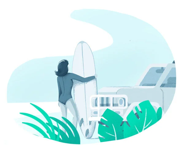
Our buyer is feeling good. She’s just been handed the keys to her new car, she’s been saving up for it for a while. This new car is part of her identity, it’s part of her future plans. She’s planning on driving to the south of France in the summer to go surfing and she can’t wait. Her car is a means to a lifestyle she wants, it’s not about the car, it’s about the experiences she’ll be able to have now she has it.
She’s online looking for Gap insurance, the car salesman tried to sell it to her, which she didn’t enjoy, but she knew she didn’t have to buy it on the spot. All of the providers look kind of negative and she’s not sure she trusts them. Until she comes across Sitback.
Everything about Sitback makes her feel calm and positive - a breath of fresh air. She is able to quickly and easily use their website to buy her Gap insurance - with just two products to choose from she’s not overwhelmed with choice.
When she finishes the confirmation reads“You’re covered, so Sitback and enjoy your new car!”
The website
The website was designed to be built with a custom CMS - because the client wanted the flexibility to try out different messaging. I created a library of styles and components that could be used by their in house team to experiment with content.

